Sunday, 27 January 2013
Connection
After the last blog on Bronze, below, all blog work was entered on a new blog (the other blog connected to me, here).

Sunday, 25 November 2012
Bronze at the Royal Academy
The exhibition was very crowded. I was impressed with the amount of objects that had been gathered together, arranged by theme.
A sign at the entrance said, "Bronze is uniquely suited to ... capturing the fall of light", so it was slightly disappointing that it was impossible to walk around many of the objects, and not just because of the crowds, but because of the way the objects were arranged. For example, Barbara Hepworth's Curved Form (Trevalgan) stuck in a glass box against a wall did it no favours at all.
A few objects were really interesting – like Picasso's bronze baboon that made use of a toy motor car for the head and a plant pot for the body; and two or Nigerian figures from the fifteenth century, the huge door knocker from Durham cathedral – and so on. There were so many varied and different pieces. The Chimaera of Arezzo, an Etruscan masterpiece on loan from Florence, was amazing. With a serpent for a tail, and a goat’s head grafted onto a lion’s back, this snarling, fire-breathing monster appears terrifying, and convincing. Hard to believe it's from 400BC. It was fascinating to see works of art from so many different cultures and ages so close together. For example, The Evening Shadow, an ancient Etruscan statuette of an elongated figure that’s really just a long stretched wire, and nearby there is The Cage by the 20th-century sculptor Alberto Giacometti, whom it influenced.
A few had incredible stories attached to them, for example, the recent discovery (2010) of a bronze head by someone with a metal detector, and the 4th Century dancing satyr found by fisherman in 1988 off the coast of Sicily..

A sign at the entrance said, "Bronze is uniquely suited to ... capturing the fall of light", so it was slightly disappointing that it was impossible to walk around many of the objects, and not just because of the crowds, but because of the way the objects were arranged. For example, Barbara Hepworth's Curved Form (Trevalgan) stuck in a glass box against a wall did it no favours at all.
A few objects were really interesting – like Picasso's bronze baboon that made use of a toy motor car for the head and a plant pot for the body; and two or Nigerian figures from the fifteenth century, the huge door knocker from Durham cathedral – and so on. There were so many varied and different pieces. The Chimaera of Arezzo, an Etruscan masterpiece on loan from Florence, was amazing. With a serpent for a tail, and a goat’s head grafted onto a lion’s back, this snarling, fire-breathing monster appears terrifying, and convincing. Hard to believe it's from 400BC. It was fascinating to see works of art from so many different cultures and ages so close together. For example, The Evening Shadow, an ancient Etruscan statuette of an elongated figure that’s really just a long stretched wire, and nearby there is The Cage by the 20th-century sculptor Alberto Giacometti, whom it influenced.
A few had incredible stories attached to them, for example, the recent discovery (2010) of a bronze head by someone with a metal detector, and the 4th Century dancing satyr found by fisherman in 1988 off the coast of Sicily..

Sunday, 11 November 2012
Taylor Wessing
I always enjoy visiting the Taylor Wessing prize portraits. This year's winner really impressed me. A very simple and direct picture. The photographer, Margarita Teichroeb, explained that she only took two frames. The expression contains so much. The subject appears insecure and yet approachable.


Going Down to Liverpool
Biennial 2012: the Cunard building
There's a huge amount of variation in this exhibition.
I was immediately taken by the curious picture by Danish collective, Superflex, of paintstakingly painted signs.

I couldn't help but wonder what it was all for. But then I was struck by the amount of empty office and commercial space in Liverpool.
It's a good idea, but also pretty bleak and boring.
Angela Lizón
The small size of the canvas was the thing that interested me. Doll's house work.

Pat O'Connor
The patchwork montage and use of different mediums – gouache, acrylic, pencil, ink, watercolour, collage – and the seeming lack of connection between the images; and yet the images seemed to work, somehow. Need to think more about this.

Jarik Jongman
This was the piece that interested me most – partly because of my own work in this are. I think Waiting Room, bleak, dark and uninviting, was also a very impressive and rich composition. I was reminded of Henry Moore's Tube Shelter paintings.

The loneliness and bleakness of the place has been further enhanced by the way Jongman has damaged the work with white spirit and scrubbing, to make the image thin on one side.
The destruction of the paint and canvas made me think hard about my own work. I am always so precise and careful and don't move on until I am absolutely certain that everything is right. The effects that Jongman has achieved, the cracking of the canvas, reminds me of the work of Old Masters.
A picture that really did impress me, part of the gallery's permanent collection, was Gustave Doré's Flower Sellers, London. It seems at first sight a slightly sentimental image, in a standard Victorian style.
 But the faces are strange and very well done. The style of painting, the anxiety, the composition, all seem to work perfectly.
There's a huge amount of variation in this exhibition.
I was immediately taken by the curious picture by Danish collective, Superflex, of paintstakingly painted signs.

I couldn't help but wonder what it was all for. But then I was struck by the amount of empty office and commercial space in Liverpool.
It's a good idea, but also pretty bleak and boring.
Angela Lizón
The small size of the canvas was the thing that interested me. Doll's house work.

Pat O'Connor
The patchwork montage and use of different mediums – gouache, acrylic, pencil, ink, watercolour, collage – and the seeming lack of connection between the images; and yet the images seemed to work, somehow. Need to think more about this.

Jarik Jongman
This was the piece that interested me most – partly because of my own work in this are. I think Waiting Room, bleak, dark and uninviting, was also a very impressive and rich composition. I was reminded of Henry Moore's Tube Shelter paintings.

The loneliness and bleakness of the place has been further enhanced by the way Jongman has damaged the work with white spirit and scrubbing, to make the image thin on one side.
The destruction of the paint and canvas made me think hard about my own work. I am always so precise and careful and don't move on until I am absolutely certain that everything is right. The effects that Jongman has achieved, the cracking of the canvas, reminds me of the work of Old Masters.
A picture that really did impress me, part of the gallery's permanent collection, was Gustave Doré's Flower Sellers, London. It seems at first sight a slightly sentimental image, in a standard Victorian style.

Turner Prize
Paul Nobel: Villa Joe (Graphite on paper).
I wasn't sure what to make of this large-scale piece. The detail was fine and distinct. The shading and tone were immaculate. Each rock, each granule, were beautifully finished. So much intricate detail. But what is it meant to be, what are you meant to make of it. I don't know. It is very repetitive. And not moving, at all.
Luke Fowler is a film maker with a good understanding of the structures of social existence. He edits moving image and sound archive material to reveal previously unseen assumptions and positions that undermine the original material.
The Two-Frame pictures were scenes from the main work, All Divided Selves. I like the way two pictures were put together. The juxtaposition of the images works well, the way that they connect with each other.

Elizabeth Price. She involves text and image to create a narrative. In the video there are images of architecture, internet clips, pop music, news footage. Authoritative statements are countered by the use of visuals and sounds that speak directly to the emotions. "The swing between analysis and sensory pleasure acknowledges the complexity of our relationship to the world of systems and ideology, and to cycles of desire and consumption."
I wasn't sure what to make of this large-scale piece. The detail was fine and distinct. The shading and tone were immaculate. Each rock, each granule, were beautifully finished. So much intricate detail. But what is it meant to be, what are you meant to make of it. I don't know. It is very repetitive. And not moving, at all.
Luke Fowler is a film maker with a good understanding of the structures of social existence. He edits moving image and sound archive material to reveal previously unseen assumptions and positions that undermine the original material.
The Two-Frame pictures were scenes from the main work, All Divided Selves. I like the way two pictures were put together. The juxtaposition of the images works well, the way that they connect with each other.

Elizabeth Price. She involves text and image to create a narrative. In the video there are images of architecture, internet clips, pop music, news footage. Authoritative statements are countered by the use of visuals and sounds that speak directly to the emotions. "The swing between analysis and sensory pleasure acknowledges the complexity of our relationship to the world of systems and ideology, and to cycles of desire and consumption."
Moriyama at Tate Modern
I loved the panel of polaroid pictures on a panel. The neat, and yet busy effect. Images almost distorted, but controlled by the grid lines.


William Klein
Exhibition at Tate Modern.
Nearly all of his pictures are of people, whether posed or unposed. Often, they are quite busy without an obvious centre of focus and the eye does not know where to look.
He documented New York as a photo diary. This reminds me of my own diary routine project. They are generally of large crowds, people in bars or on the train – and there's a great sense of New York to them.

Quite a few of his pictues are out of focus in parts. I prefer the smaller images and am not particularly keen on those pictures that don't involve people.
The exhibition display reminds me of a comic strip, with frames the same size and distance apart and all black-and-white.
I was interested to read that before he took up photography he was an abstract painter.
In one room is a long series of photographs of people standing waiting on a train platform. The faces look like they've been edited in PhotoShop. But I like the way the frames are set out, that enable you to walk along in front, as if on an inspection.
Nearly all of his pictures are of people, whether posed or unposed. Often, they are quite busy without an obvious centre of focus and the eye does not know where to look.
He documented New York as a photo diary. This reminds me of my own diary routine project. They are generally of large crowds, people in bars or on the train – and there's a great sense of New York to them.

Quite a few of his pictues are out of focus in parts. I prefer the smaller images and am not particularly keen on those pictures that don't involve people.
The exhibition display reminds me of a comic strip, with frames the same size and distance apart and all black-and-white.
I was interested to read that before he took up photography he was an abstract painter.
In one room is a long series of photographs of people standing waiting on a train platform. The faces look like they've been edited in PhotoShop. But I like the way the frames are set out, that enable you to walk along in front, as if on an inspection.
Sunday, 28 October 2012
Aliki Krikidi
Aliki Krikidi thinks of the city as a territory that is hard to break out of, where everyone keeps their head down. Perhaps this is to guard against the leaking out of personality.
I like the style of her work, and her thoughts about "the mask that the city wears" which provides it with "an unmistakeable persona" that defines "the rituals of its inhabitants".
She talks of the "desire of the city" (by which she presumably means the collective emotion of the individuals who live there) to be "recognised" being "indivisible from its desire to be immortal, to overcome the morality of its residents".
This is another level of thinking that I don't quite get, but want to think about!
I also like the glances that are captured in the work shown below. The places where the city, keeping its head down, avoiding contact, suddenly or momentarily catches the eye. It is what is seen then, the haunted life of the city, that is moving.
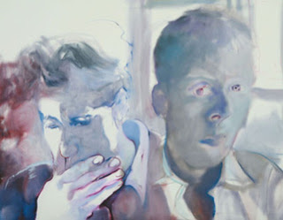
I like the style of her work, and her thoughts about "the mask that the city wears" which provides it with "an unmistakeable persona" that defines "the rituals of its inhabitants".
She talks of the "desire of the city" (by which she presumably means the collective emotion of the individuals who live there) to be "recognised" being "indivisible from its desire to be immortal, to overcome the morality of its residents".
This is another level of thinking that I don't quite get, but want to think about!
I also like the glances that are captured in the work shown below. The places where the city, keeping its head down, avoiding contact, suddenly or momentarily catches the eye. It is what is seen then, the haunted life of the city, that is moving.

Mara Bodis-Wollner
What I like about her work is the way she takes pictures that are obviously staged, but that contain more, somehow. Real life leaks out at the edges of the pictures. There are details that transcend the performance.
This way of thinking reminds me of my train video work... I must try to connect the two...

There is an element of performance in people's public expression of themselves, even when they attempt to conceal it, as here.
This way of thinking reminds me of my train video work... I must try to connect the two...

There is an element of performance in people's public expression of themselves, even when they attempt to conceal it, as here.
Stephen Farthing
I listened to Stephen Farthing and felt some affinity with things he was saying.
For example he said that it is important to enjoy your work. If you don't enjoy what you are doing, then you are probably doing the wrong thing.
I also liked the way his work grows in the studio, it isn't all mapped out in his head beforehand. He is "constructing realities, not observing realities". This is how I work.
And it's good to hear some other things, too, just small details. Like the fact that he paints while listening to Talk Radio and can't paint to music, because music affects his work.
For example he said that it is important to enjoy your work. If you don't enjoy what you are doing, then you are probably doing the wrong thing.
I also liked the way his work grows in the studio, it isn't all mapped out in his head beforehand. He is "constructing realities, not observing realities". This is how I work.
And it's good to hear some other things, too, just small details. Like the fact that he paints while listening to Talk Radio and can't paint to music, because music affects his work.
Sunday, 21 October 2012
Doug Fishbone
I enjoyed a talk from Doug Fishbone. What I liked best about it was his urgency: if you think of something, just do it. A good example is the heap of bananas he dumped in Trafalgar Square. He had the idea and just went for it.

It's a strong and striking idea. How would the public put 30,000 bananas in context? Do they think of global food issues? What happens when people come up and help themselves to the bananas?
There's also the story of Nigerian films. He had noticed there were plenty of Nigerian films in his newsagent, but they were full of black people. So he went to Nigeria and talked himself into a Nigerian film.

The obvious analogy would be to a version of Othello where the entire cast is black, except for Othello, who is white.
Fishbone says that he doesn't necessarily come up with any brilliant new ideas, but he does follow through on the ideas he has.

It's a strong and striking idea. How would the public put 30,000 bananas in context? Do they think of global food issues? What happens when people come up and help themselves to the bananas?
There's also the story of Nigerian films. He had noticed there were plenty of Nigerian films in his newsagent, but they were full of black people. So he went to Nigeria and talked himself into a Nigerian film.

The obvious analogy would be to a version of Othello where the entire cast is black, except for Othello, who is white.
Fishbone says that he doesn't necessarily come up with any brilliant new ideas, but he does follow through on the ideas he has.
Friday, 12 October 2012
Yellowism
What do I think of yellowism?

I know a man has been charged with defacing the Rothko painting. "Wlodzimierz Umaniec, 26, a Polish national of no fixed abode, will appear at Camberwell Green Magistrates' Court on Wednesday. Mr Umaniec, also known as Vladimir Umanets, is charged with one count of causing criminal damage in excess of £5,000."
All accounts talk about the value of the painting, in millions of pounds. That seems somehow beside the point, but with art today, talk of money is never far away. Umaniec says it wasn't vandalism, it was a case of yellowism.
What is yellowism?
 This is from the website and I confess it doesn't make much sense to me.
Umanets has compared himself to Marcel Duchamp. He has said:
"Art allows us to take what someone's done and put a new message on it."
Duchamp once doodled on a postcard depicting the Mona Lisa. And there are other examples of artists changing or adapting copies of great works of art. See Mary Beth Edelson in an earlier blog and her adaptation of The Last Supper.
The difference here is that it is a real piece of art that has been changed. For me, this seems a kind of arrogance, something of a publicity stunt; and a real act of vandalism. It spoils a work of art that people have come to see – that belongs to them, not the yellowist. His actions may make it more difficult for people to get close to art in the future. That can't be a good thing.

I know a man has been charged with defacing the Rothko painting. "Wlodzimierz Umaniec, 26, a Polish national of no fixed abode, will appear at Camberwell Green Magistrates' Court on Wednesday. Mr Umaniec, also known as Vladimir Umanets, is charged with one count of causing criminal damage in excess of £5,000."
All accounts talk about the value of the painting, in millions of pounds. That seems somehow beside the point, but with art today, talk of money is never far away. Umaniec says it wasn't vandalism, it was a case of yellowism.
What is yellowism?

Umanets has compared himself to Marcel Duchamp. He has said:
"Art allows us to take what someone's done and put a new message on it."
Duchamp once doodled on a postcard depicting the Mona Lisa. And there are other examples of artists changing or adapting copies of great works of art. See Mary Beth Edelson in an earlier blog and her adaptation of The Last Supper.
The difference here is that it is a real piece of art that has been changed. For me, this seems a kind of arrogance, something of a publicity stunt; and a real act of vandalism. It spoils a work of art that people have come to see – that belongs to them, not the yellowist. His actions may make it more difficult for people to get close to art in the future. That can't be a good thing.
Saturday, 29 September 2012
Update
I have had a pretty busy summer, but have not spent much time on the computer. I have kept notebooks instead. So what I'll do now is to put in some of these notes, just to get in the swing of blogging, again.
Two Directions
I want to keep up my series of commuter paintings. It's an interesting subject for me, as I have been a commuter. I'm still taking phone pictures of commuters and I like trying to compose pictures from these pictures. Putting together people from different pictures. I have to get a few pictures together for the subject to make sense. So I have finished one picture and have another that is well underway.

I have also been experimenting with collage, particularly painting over photos and parts of the background. Thick paint, impasto in places, thinking hard about light and dark, leaving the background bare. I got some old photographs from an antiques market in Brighton and made a patchwork blanket. I also got interested in everyday print that gets neglected – things like barcodes, age-restriction warnings, health warnings. And I tried to work these up into something.

New York and elsewhere
I went to New York and was struck by a number of things in galleries there that hadn't occurred to me, before. They weren't amazing revelations, but I hadn't thought about them, before. For example, I liked the way that Picasso and Cézanne focused on figures in certain paintings and didn't appear to be too concerned about background. For example, Picasso's Boy Leading a Horse and Cézanne's The Bather.

 The compositions are quite similar, the same neutral colours. The backgrounds only giving an impression of light.
I found this, too, in a Turner picture – not in Tate Britain! – in The Frick. The artist working to show the light, not the details. And I wondered if I ought to change my working practice. My paintings are time-consuming and I wonder if it would be better if I relaxed on the background detail, and concentrated instead on the light.
I was still working on the first of my commuter series at the time and it wasn't the right picture to change the approach, but thinking on the subject gave me the idea to experiment with backgrounds in different ways.
In my second painting, on a smaller, thinner canvas, I again pencilled lightly a grid and the outline of the picture. And then I worked up a tonal underlayer with burnt amber, white and burnt sienna.

But when it came to the background, I let the window light spill on the woman and into the background, and placed a ghostly figure through the light. Here is the half-finished picture and then the final piece:


In New York I also came across a number of artists that worked with collage in ways I hadn't really seen before. James Rosenquist's eight colleges in MOMA really got me interested in collages of printed paper, gelatin silver prints, transparent overlays, metal, synthetic polymer paint, ballpoint pen, felt-tip, crayon and masking tape. The wide range of mediums really seemed exciting. Some of the collages focused on compositional structure and the sequence of images. Others incorporated images from magazines. Here's a picture of some of the Rosenquist images in my notebook:

I was also very struck by Eduardo Paolozzi's Dr Dekker's Entrance Hall. A robot from the sixties, or a children's book – and over the top a picture from a book on German tile manufacturers. Paolozzi has said, "What I like to think I'm doing is an extension of radical surrealism". Surrealists liked the idea of the automaton, half-human/half-machine, the confusion between the living and the inanimate that Freud called the Uncanny. What I liked was the way neither image was in colour and yet there were different tones in each picture – and how they appeared to be together as one picture but are in fact from two different sources.
Mary Beth Edelson undermined classic art in a really interesting way. I particularly liked Happy Birthday America and Some Living American Artists. This is a way for collage to challenge perceptions of art and life that works very well.
 While in New York I visited a community center in East Harlem where there was an exhibition of the life and gun/gang culture in the Puerto-Rican community. The pictures were shocking – for example, a father showing his baby how to hold a gun, while the young mother looks on, smiling - and I couldn't relate easily to the unsentimental images. The harsh black and white seemed appropriate, suited the atmosphere and darkness of the pictures. It was unglamorous, challenging, and it made me wonder about the role of violence in that community. In addition, I realised how different the way of life in that area was from my life.
One of the galleries I enjoyed most was the Museo el Barrio, a celebration of Puerta Rican art . Many of the pictures from the middle of the last century were figurative, and I wondered if this was an assertion of identity. I walked around the district and saw there was a great deal of street art. I don't mean graffiti, but murals. Many of the murals featured well-known people from the "hood". There was also graffiti, but it was in separate places. And someone explained that the different artists respected one another.

It occurred to me how important graffiti and murals were to the community. Big Money takes most of the available image space for ads featuring fast food and coke and all kinds of rubbish, and there is no place for people to express themselves. For the urban artists in this area of New York, graffiti was a way of reclaiming their community, of taking control of their lives. It was a question of identity. And that must be an important aspect of art.
But compare the graffiti that's approved of, colourful and positive, from el Barrio, with the section of wall that I saw in Naples, later in the summer. The latter image has a completely different feel. It's angry, political, violent – and has nothing to with a sense of community.


It makes me think the first image is too "pretty". Or rather, it has an impact that is strong on design, but it's basically wallpaper. The second image has more power, because it isn't trying to be attractive, it's people trying to get their messages across by overwriting one another. Somehow, it's also disheartening.
Two Directions
I want to keep up my series of commuter paintings. It's an interesting subject for me, as I have been a commuter. I'm still taking phone pictures of commuters and I like trying to compose pictures from these pictures. Putting together people from different pictures. I have to get a few pictures together for the subject to make sense. So I have finished one picture and have another that is well underway.
I have also been experimenting with collage, particularly painting over photos and parts of the background. Thick paint, impasto in places, thinking hard about light and dark, leaving the background bare. I got some old photographs from an antiques market in Brighton and made a patchwork blanket. I also got interested in everyday print that gets neglected – things like barcodes, age-restriction warnings, health warnings. And I tried to work these up into something.
New York and elsewhere
I went to New York and was struck by a number of things in galleries there that hadn't occurred to me, before. They weren't amazing revelations, but I hadn't thought about them, before. For example, I liked the way that Picasso and Cézanne focused on figures in certain paintings and didn't appear to be too concerned about background. For example, Picasso's Boy Leading a Horse and Cézanne's The Bather.


I found this, too, in a Turner picture – not in Tate Britain! – in The Frick. The artist working to show the light, not the details. And I wondered if I ought to change my working practice. My paintings are time-consuming and I wonder if it would be better if I relaxed on the background detail, and concentrated instead on the light.
I was still working on the first of my commuter series at the time and it wasn't the right picture to change the approach, but thinking on the subject gave me the idea to experiment with backgrounds in different ways.
In my second painting, on a smaller, thinner canvas, I again pencilled lightly a grid and the outline of the picture. And then I worked up a tonal underlayer with burnt amber, white and burnt sienna.

But when it came to the background, I let the window light spill on the woman and into the background, and placed a ghostly figure through the light. Here is the half-finished picture and then the final piece:

In New York I also came across a number of artists that worked with collage in ways I hadn't really seen before. James Rosenquist's eight colleges in MOMA really got me interested in collages of printed paper, gelatin silver prints, transparent overlays, metal, synthetic polymer paint, ballpoint pen, felt-tip, crayon and masking tape. The wide range of mediums really seemed exciting. Some of the collages focused on compositional structure and the sequence of images. Others incorporated images from magazines. Here's a picture of some of the Rosenquist images in my notebook:
I was also very struck by Eduardo Paolozzi's Dr Dekker's Entrance Hall. A robot from the sixties, or a children's book – and over the top a picture from a book on German tile manufacturers. Paolozzi has said, "What I like to think I'm doing is an extension of radical surrealism". Surrealists liked the idea of the automaton, half-human/half-machine, the confusion between the living and the inanimate that Freud called the Uncanny. What I liked was the way neither image was in colour and yet there were different tones in each picture – and how they appeared to be together as one picture but are in fact from two different sources.
Mary Beth Edelson undermined classic art in a really interesting way. I particularly liked Happy Birthday America and Some Living American Artists. This is a way for collage to challenge perceptions of art and life that works very well.

One of the galleries I enjoyed most was the Museo el Barrio, a celebration of Puerta Rican art . Many of the pictures from the middle of the last century were figurative, and I wondered if this was an assertion of identity. I walked around the district and saw there was a great deal of street art. I don't mean graffiti, but murals. Many of the murals featured well-known people from the "hood". There was also graffiti, but it was in separate places. And someone explained that the different artists respected one another.

It occurred to me how important graffiti and murals were to the community. Big Money takes most of the available image space for ads featuring fast food and coke and all kinds of rubbish, and there is no place for people to express themselves. For the urban artists in this area of New York, graffiti was a way of reclaiming their community, of taking control of their lives. It was a question of identity. And that must be an important aspect of art.
But compare the graffiti that's approved of, colourful and positive, from el Barrio, with the section of wall that I saw in Naples, later in the summer. The latter image has a completely different feel. It's angry, political, violent – and has nothing to with a sense of community.

It makes me think the first image is too "pretty". Or rather, it has an impact that is strong on design, but it's basically wallpaper. The second image has more power, because it isn't trying to be attractive, it's people trying to get their messages across by overwriting one another. Somehow, it's also disheartening.
Saturday, 28 April 2012
Sohei Nishino
Nishino says, 'we are overmapped...we over-analyse, today.'

His composite images, Dioramas of New York, where everything connects somehow, make for an interesting subversion of the expected geography of the city.


His composite images, Dioramas of New York, where everything connects somehow, make for an interesting subversion of the expected geography of the city.
Imaginary maps
Someone has said that my faces resemble maps. I like that idea. A face is a map, in a way. I think it's important to understand that portraits are a form of personal geography. Someone else very kindly compared my work to that of Alison Lambert (see the picture I have cut out in my scrapbook, below).

Playing around in my work, I have tried floating faces over a photograph to create a kind of dream landscape.

Playing around in my work, I have tried floating faces over a photograph to create a kind of dream landscape.
John Stezaker
John Stezaker (like Daniel Gordon) rips up the usual idea of the photograph. These images are obviously untrue and they give a different, disturbing image of modern culture. He slices and splices pictures from magazines and postcards, classic publicity shots of film stars - making hybrid faces that combine male and female faces. It's surreal and grotesque, but there's still a sense of glamour - and this reordering of photographic truth appeals to me.

Daniel Gordon
I saw one of Daniel Gordon's portraits in a Sunday supplement. And then came across his work again at the Out of Focus exhibition at the Saatchi Gallery.

None of this picture is part of a face. In places it looks as if pieces of paper are stuck on a real face. The nose, eyes and mouth are casually, loosely applied and well hidden among the ripped-up pieces of paper. This seems like photograph, sculpture and collage in one.
I like the idea that NONE of this is done in PhotoShop.
"When I started making these pictures, Photoshop was really blossoming in the photo community," he recalls. "I was interested in pursuing a project that would showcase traditional methods of manipulation with straight photography. I can fly, just not very well."
Sometimes he sources images from Google...
Would like to try this idea of modelling up a face shape - maybe around a polystyrene ball.
None of this picture is part of a face. In places it looks as if pieces of paper are stuck on a real face. The nose, eyes and mouth are casually, loosely applied and well hidden among the ripped-up pieces of paper. This seems like photograph, sculpture and collage in one.
I like the idea that NONE of this is done in PhotoShop.
"When I started making these pictures, Photoshop was really blossoming in the photo community," he recalls. "I was interested in pursuing a project that would showcase traditional methods of manipulation with straight photography. I can fly, just not very well."
Sometimes he sources images from Google...
Would like to try this idea of modelling up a face shape - maybe around a polystyrene ball.
Thursday, 26 April 2012
Damien Hirst at the Tate Modern
In the second room were a couple of large dot canvases but what captured the attention was a big glass box in the centre of the room. In the box were swarms of big black flies. A great many of the flies crawled over a cow's head that lay on its side on the floor in a pool of congealed blood. It was shocking, and I suppose it did throw up issues of life and death.

The shark tank - The Physical Impossibility of Death in the Mind of Someone Living - seems intended to provoke fear and awe, but the shark looked a bit done in. Its skin was wrinkled the way skin wrinkles when it has been in the bath too long. When I stared at the dead eyes of the shark, though, I could get a slight sense of discomfort.

The exhibition was set out like a factory, or like an amusement park. Many of the pieces seemed unconnected with one another. One or two very simple ideas did make a big impact. For example, a giant circular ashtray filled with cigarette butts, called The Acquired Inability to Escape. The stink of cigarettes and the scale of the piece gave me a feel for the nature of the addiction.

Another room was laid out like a pharmacy with a counter, with a coffee cup on the counter. Normal items on the shelves, a clinical feel to the room. This, by the way, was the second reminder, for me, of another exhibition - that of Jeremy Deller at the Hayward Gallery...in his exhibition was a giant cup of tea (instead of an ash tray) and a full-size sixties cafe (instead of a pharmacy). On the counter were big glass vases filled with coloured liquids that were meant to symbolise the four elements and are meant to suggest the power of modern medicine. The neatness of the cabinets, the packets and packets of pills and tablets, were striking. However, Hirst's view is that 'you can only cure people for so long and then they are going to die, anyway'.


The exhibition did confront me with life and death, the decay of corpses, all the dead animals in formaldehyde, and even the chemist's shop. There was also some vivid colour in the splatter pictures, beauty in the butterfly patterns.

Hirst said 'Life and death are the biggest polar opposites there are. I like love and I like hate. I like all these opposites. On and off. Happy and sad. In artwork I always try to say something and deny it all the time.' The diamond skull is a great example of this, the preposterous decoration of a skull with precious stones.
The shark tank - The Physical Impossibility of Death in the Mind of Someone Living - seems intended to provoke fear and awe, but the shark looked a bit done in. Its skin was wrinkled the way skin wrinkles when it has been in the bath too long. When I stared at the dead eyes of the shark, though, I could get a slight sense of discomfort.
The exhibition was set out like a factory, or like an amusement park. Many of the pieces seemed unconnected with one another. One or two very simple ideas did make a big impact. For example, a giant circular ashtray filled with cigarette butts, called The Acquired Inability to Escape. The stink of cigarettes and the scale of the piece gave me a feel for the nature of the addiction.
Another room was laid out like a pharmacy with a counter, with a coffee cup on the counter. Normal items on the shelves, a clinical feel to the room. This, by the way, was the second reminder, for me, of another exhibition - that of Jeremy Deller at the Hayward Gallery...in his exhibition was a giant cup of tea (instead of an ash tray) and a full-size sixties cafe (instead of a pharmacy). On the counter were big glass vases filled with coloured liquids that were meant to symbolise the four elements and are meant to suggest the power of modern medicine. The neatness of the cabinets, the packets and packets of pills and tablets, were striking. However, Hirst's view is that 'you can only cure people for so long and then they are going to die, anyway'.
The exhibition did confront me with life and death, the decay of corpses, all the dead animals in formaldehyde, and even the chemist's shop. There was also some vivid colour in the splatter pictures, beauty in the butterfly patterns.
Hirst said 'Life and death are the biggest polar opposites there are. I like love and I like hate. I like all these opposites. On and off. Happy and sad. In artwork I always try to say something and deny it all the time.' The diamond skull is a great example of this, the preposterous decoration of a skull with precious stones.
Tuesday, 24 April 2012
William Utermohlen (1933-2007)
I want to create work based around things I'm interested in. Sounds obvious, I guess. But work that I will feel proud of, the journey and the result. The question, then, I guess, is what interests me? Work that has details and attention to details.
I also enjoy working in mixed media and for me at the moment this means, perhaps, photography, charcoal, biro. I am interested in the contrast between thick charcoal lines and thin biro, the matt dustiness of charcoal, the shiny glow of the ink.
Recently I visited the GV Art Gallery (49 Chiltern St, Marylebone) where there was an exhibition of William Utermohlen's work. (He was part of a couple that were friends of a relative, so there was some interest, there.)
In 1995, William Utermohlen was diagnosed with Alzheimer's disease. His final portraits, that explore his reaction to the diagnosis, have received great critical acclaim.

This, his Imaginary Portrait of Francis Bacon, 1967, altered 1997, in watercolour and oil, on paper, is remarkable.
He created a cycle of paintings based on Dante's Inferno and in the exhibition there was also an interesting series of lithographs that reflect his interest in the Vietnam War.
What interested me most were his charcoal drawings that were mixed with bright, thick paint. It was unexpected.
I also liked the unusual technique that gave a scratchy surface quality to certain pictures.
At the moment, I find that my work usually stems from photographs I have taken of people at train stations, or of train stations. I'm thinking of working at a very big size and at a very small size.
I'm thinking of visiting the 270 tube stations and taking pictures of any details that interest me at each one, then combining them with paint, perhaps fragments of plastic, giving the images a grimy effect, like looking through the window of a tube, framing them.
People say it's not interesting to paint or draw from photographs, but for me, it is interesting and the result is as different from a photograph as usual.
Looking at the skin I want to emphasise every tone and shadow on the face.
I am now thinking in terms of ink and sticks, different-sized nibs, plus definitely charcoal and paint.
I've also had the idea of collaging my photos then drawing over the top in biro...
I also enjoy working in mixed media and for me at the moment this means, perhaps, photography, charcoal, biro. I am interested in the contrast between thick charcoal lines and thin biro, the matt dustiness of charcoal, the shiny glow of the ink.
Recently I visited the GV Art Gallery (49 Chiltern St, Marylebone) where there was an exhibition of William Utermohlen's work. (He was part of a couple that were friends of a relative, so there was some interest, there.)
In 1995, William Utermohlen was diagnosed with Alzheimer's disease. His final portraits, that explore his reaction to the diagnosis, have received great critical acclaim.

This, his Imaginary Portrait of Francis Bacon, 1967, altered 1997, in watercolour and oil, on paper, is remarkable.
He created a cycle of paintings based on Dante's Inferno and in the exhibition there was also an interesting series of lithographs that reflect his interest in the Vietnam War.
What interested me most were his charcoal drawings that were mixed with bright, thick paint. It was unexpected.
I also liked the unusual technique that gave a scratchy surface quality to certain pictures.
At the moment, I find that my work usually stems from photographs I have taken of people at train stations, or of train stations. I'm thinking of working at a very big size and at a very small size.
I'm thinking of visiting the 270 tube stations and taking pictures of any details that interest me at each one, then combining them with paint, perhaps fragments of plastic, giving the images a grimy effect, like looking through the window of a tube, framing them.
People say it's not interesting to paint or draw from photographs, but for me, it is interesting and the result is as different from a photograph as usual.
Looking at the skin I want to emphasise every tone and shadow on the face.
I am now thinking in terms of ink and sticks, different-sized nibs, plus definitely charcoal and paint.
I've also had the idea of collaging my photos then drawing over the top in biro...
Sunday, 22 April 2012
Hans-Peter Feldmann
Another wacky exhibition at the Serpentine gallery, but I really like visiting, there's always something that makes it worthwhile.
I knew Hans-Peter Feldmann for his kitsch painting of classical statues, and I really appreciated his inventiveness and daring. Among the exhibits was a collection of women's handbags that were displayed with all contents.
There was a collection of seascapes that caught my eye, briefly, but what I liked best was the shadowplay piece: tables of odd objects (toy dinosaurs, broken barbies etc) rotating in front of spotlights that threw spectacular shadows on the wall.

I knew Hans-Peter Feldmann for his kitsch painting of classical statues, and I really appreciated his inventiveness and daring. Among the exhibits was a collection of women's handbags that were displayed with all contents.
There was a collection of seascapes that caught my eye, briefly, but what I liked best was the shadowplay piece: tables of odd objects (toy dinosaurs, broken barbies etc) rotating in front of spotlights that threw spectacular shadows on the wall.

Subscribe to:
Posts (Atom)